01. PROJECT OVERVIEW
Working with Parques Reunidos, we had to build their global websites with a unique design system, and an upgraded and common technology (funnel and e-commerce) focusing on the enhancement of the user experience and the maximisation of the online sales.
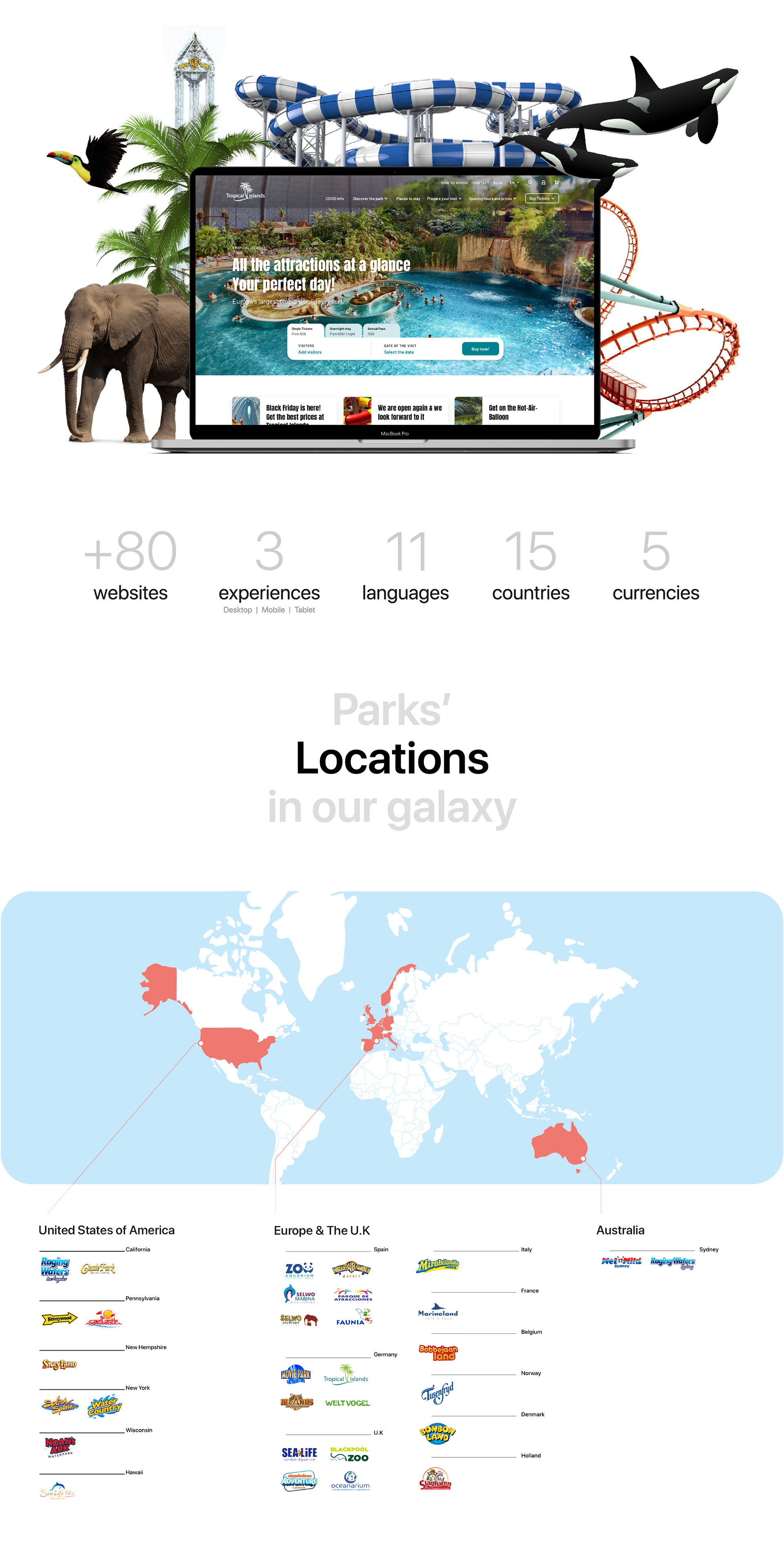
+80 websites
2 experiences (mobile & desktop/tablet adapted)
+11 languages
+15 countries
5 currencies
To achieve this project, +220 dedicated multidisciplinary FTEs are being orchestrated with the client and two service providers (Analytics, Search Strategy, UX/UI, Web Development, and Content).
Within the project, I was a UI & UX Consultant. Working with a team of amazing product specialists (Elena Benito, Pablo de Juan, Diego de Campo, Almudena Trujillano, Antonio Jimeno, Carlota Fernandez, and Bianca Brachetti). The tools used for this project were Sketch, Figma, Trello, InVision, Abstract, Jira and Excel.
02. PROJECT GOALS
- Creating 1 unique and uniform Design System covering local gaps and different types of parks (theme, aquatics, zoos & resorts)
- Unify technology (common CMS, e-commerce tool, backend & analytics)
- Simpler technical maintenance and daily management
- Strengthen digital team and capacities, working in an agile way
- Increase unpaid traffic (~8-15%) and conversion rate (~20%)
- EBITDA impact: from €15M in 21 months (assuming a normal year) to + €12M in 24 months
03. UNDERSTANDING THE PROBLEM
Knowing the project goals, it was time to identify the main problems in their current websites. Listed below are some of the main issues we saw in the Legacy webs:
- Not user friendly
- Small text, CTAs that weren’t clear and confusing navigation
- The menu header wasn't clear
- Not accessible
- Bad responsive experience
- Too many (confusing) steps during the ticket purchase process causing users leakage in the most important steps
04. RESEARCH & INSIGHTS
After identifying the general bugs and defining our goals for the project, we proceed to divide the parks into waves, each wave had a specific thematic and reason to be:
🌊🎢 Wave 1 _____ European Themed Parks
🌊🎡 Wave 2 ____ American & Australian Themed Parks
🌊🐼 Wave 3 ____ ZOOs & Aquariums
🌊🏨 Wave 4 ____ Resort Parks
🌊💧 Wave 5 ____ Aquatic Parks
Afterwards, we proceed to interview a responsible for each park, so we could gather the maximum information about their current pain points with their webs and payment funnels, and also, to understand the cultural differences and needs of each park to take them into account while designing the new platform. Furthermore, using these insights we crafted 10 personas, to capture the pain points and frustrations of our target users.
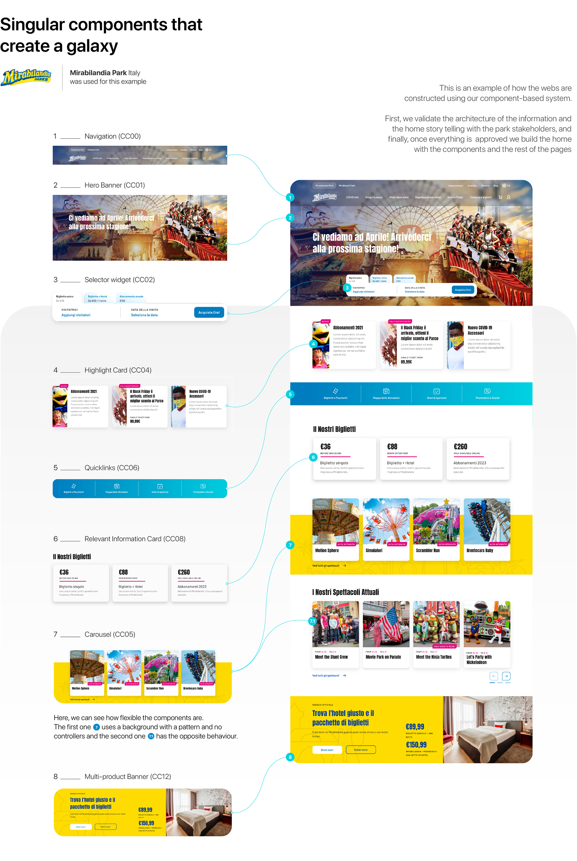
05. DEFINING THE COMPONENTS
Thanks to the research we conducted previously, we came up with a component-like type of solution for this project. Meaning that all parks will have a set of common components, but each park with be unique through the design system where they can customize the colours, fonts, and currency.
First, we defined them to a functional level, validating their functionalities with the key stakeholders, making sure they will be fully responsive, accessible, and coherent throughout the whole web.
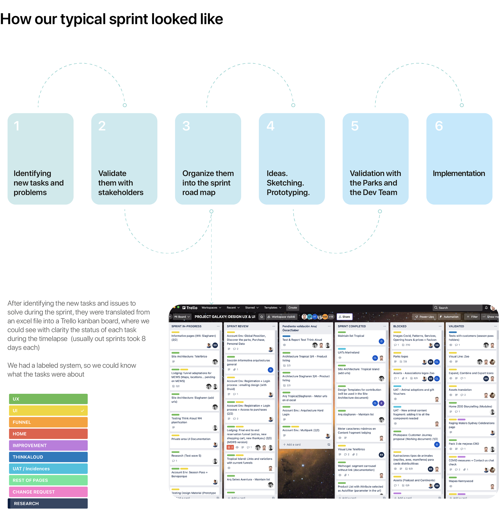
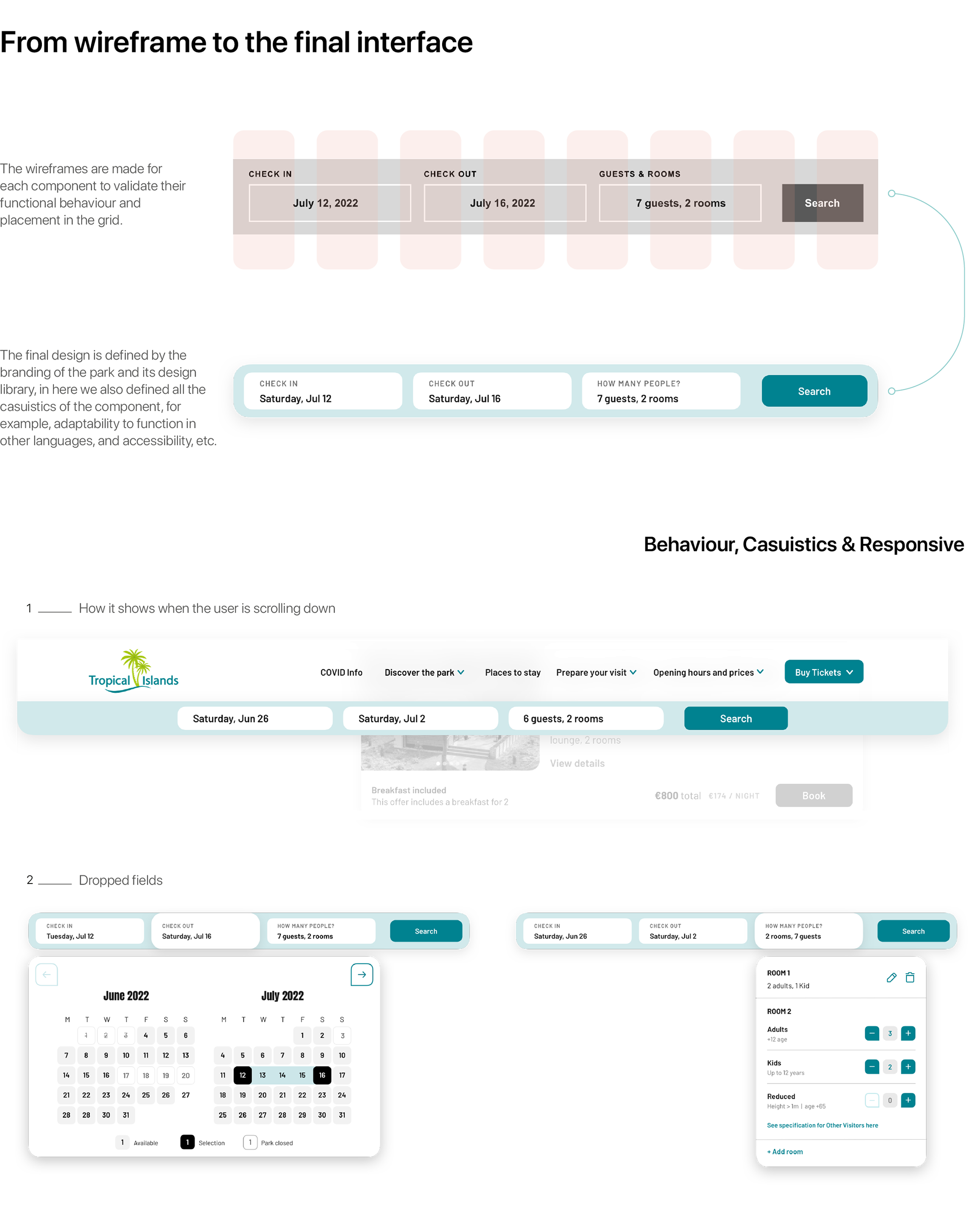
06. LO-FI TO DELIVERIES
With these, we ran five concept tests and then settled on a user flow that we would use to begin creating Lo-fi prototypes of the components. The key part of this process was determining exactly which questions we needed to validate with the stakeholders and what problems we were solving for the user, and in what order.
Below we can appreciate a very, very… very simplified example of this process.
07. DESIGN SYSTEM AND UI REFINEMENT
We faced 3 main challenges while designing the design system, those were:
- Neutral Interface that could be accessible to all parks
- Customisable interface where branding should be shown on the interface
- Skeuomorphism vs. Flat design, going from more to less.
Every design system is supported on top of some main basics that will help to build the rest of the components and give unity and consistency to all the elements
- Grid: To give a basis for where the website will be built. We established a 12-column grid for desktop and a 4-column for mobile.
- Typography: Two were proposed by the team (Anton & Barlow), but parks were treated particularly in case they needed another font.
- Colours: Defined according to each park’s branding system
- Iconography and patterns: Unique and simple style for all parks to enhance the communication and help the brand to be more powerful.
08. FINAL INTERFACES
09. GALAXY RESULTS
Galaxy Project has beaten its objectives in 2021 and is expected to even improve them in the following years. The main success KPIs are:
- Organic (not paid) traffic: +1,6M additional organic sessions (+14%)
- Conversion rate: +0.5 p.p. conversion rate (+23%)
- Visitors: +0.5M additional visitors (+34%)
- Revenues: +20.5M € additional revenues (+33%)
- EBITDA: +10.2M € impact on EBITDA (+33%)


